The achieves the maximum
distraction of the reader and annoys them quite well.
Librally spronkle spelimg
mistaks throw your document.
Next type your text
in a color which really stands
out against the background.
Failing
that
try to
make
every
word
or
even
every
letter
a
different
color.
White text on a black background
is really good when it comes to printing out a web page
and also saves on the black ink.
Use italics all
the time It looks really cool.
Use
lots of
different fonts
especially fonts
which the reader
is not
likely to
have on
their computer
and which probably
won't be
displayed.
Typing in the symbolfont
is a good way of making what you type completely unintelligable
ANOTHER
GOOD EFFECT IS TO USE A SCRIPT FONT IN ALL UPPER CASE LETTERS.
dON'T FORGET TO
TYPE WITH THE CAPS LOCK KEY ON.
Whilst yer at't makes
shore yous iklud lots uv thangs that sho off yore gud grammer,
likes I's done.
Don't
forget to include lots of graphics and then forget to upload
them to the web site. Make sure your captions below or above
the graphic are totally NOT relevat to the graphic. Like this
one.
How to raise rabbits.
As an alternative to writing in
a non contrasting colour, you can try this effect:
A really rotten background.
It's so bad, that you can't read
No matter what colour you type in
white,pink,light
orange,lt. yellow, light
green, light blue, light
lavender, or even black.
All of them stand out really badly
against this background. .
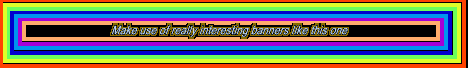
You want to make sure to place plenty
of colourful banner advertisements on your page. These help
to draw attention and increase your hits. Always be sure that
you choose a banner that is completely out of contrast with
the rest of your page, like this one:
If you find this banner hard to read, then you can be sure
if you participate in one of the free banner exchange services
and use this as your banner, you will attract LOTS of visitors
to your site.
Everyone likes popup windows - they give the viewer some
pretty 's
to click on while they are waiting for your page graphics
to load
Include lots of Java - especially one's which take at least
3 min. to load and then don't work properly.
This
colorizer
effect
is
so
pretty,
we
recommend
you
use
it
liberally.
An
entire
page
of
text
written
in
it
would
be
very
psycadelic
and
will
make
you
want
to
let
your
hair
grow
and
start
giving away flowers
while burning your draft card.
Not
to
mention
using
the
old
fashion
phrase
"Cool
Man!"
Make sure your page disgusts or offends
at least three factions and then put your email address on
it so they can send you nice comments.
Include lots of links
which need checking at
least once every decade
to make sure they work.
lways amke ruse ouy chek
fro lla syotp nad rreoct htem
Visitor really love to
see text that looks like a link but is not, so be sure and
include lots of blue text
that is underlined.
Let's face it, it will give them something
to do while listening to the
really
bad midis you have included.
Let's not forget sound. Make sure it
autostarts, loops and that you hide the controls from the
visitor.
At the appropriate time of year you can add an mp3 which everyone is already sick of and even add some distracting falling graphics. Of course for best effect leave this on your page for at least a month more than the 'appropriate' holiday. At other times of year choose your midis very wisely
making sure they are completely out of tune like this
one. Nah! We are not prepared to do that to you. If you would
like to hear a REALLY bad midi click
here.
Cells can span columns
- good in the middle
of a table
Or
Rows
This bit takes
choose
The
odd
row
like
this
helps
special care
color
Layers can be very useful, but of course, you should
This is a layer used effectively.
always arrange the layers so that they cover
up an essential bit of text. If you can arrange it so that they
cover up the instructions then so much the better.
Finally we have spent a great deal of time creating a web
page with as many mistakes in it as possible. We think we
have covered everything but if you can think of anything we
left out pleasesend us an e-mail and we will endevour to include
it. E-mail
us
Include an ugly page counter - if you can't find one then
use one of these and mess with the code to make it more obvious.
Lie about how many visitors the page has had.
LE
FastCounter
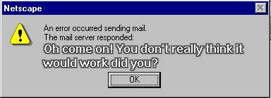
Oh! Almost forgot. Be sure to include a few links to pages which drool praise for your own pages.(our own favourite is PCWorld's recommendation that we be voted Site of the year) Worst Site Design Ugly
(We especially like their link to a defunct website) 'Hilarious page'
If you really MUST know how we achieved some of these wonderful effects then maybe you should look at our explanatory page.
Oops. Shouldn't the 'Finally' bit be here? Oh what the heck.....
This is a polite way of telling
someone what you think about their 'great' web pages.
 Don't
forget to include lots of graphics and then forget to upload
them to the web site. Make sure your captions below or above
the graphic are totally NOT relevat to the graphic. Like this
one.
Don't
forget to include lots of graphics and then forget to upload
them to the web site. Make sure your captions below or above
the graphic are totally NOT relevat to the graphic. Like this
one.